Artisan numérique d’organisation

Work now

Faux

La mort de Saturne

Chiffres gestés

La piscine

À quoi sert la comptabilité et pourquoi le patrimoine n’est pas un luxe ?

Palatin d’avenir

La route des vacances, les cris des enfants — le social de la banquette arrière au moteur

Les Experts-Comptables et leurs “outils” — cartes sur table

Portland et son complexe
Plugged to Portland to both a new port and a new land
Retour sur les admissibles Neoma 2023

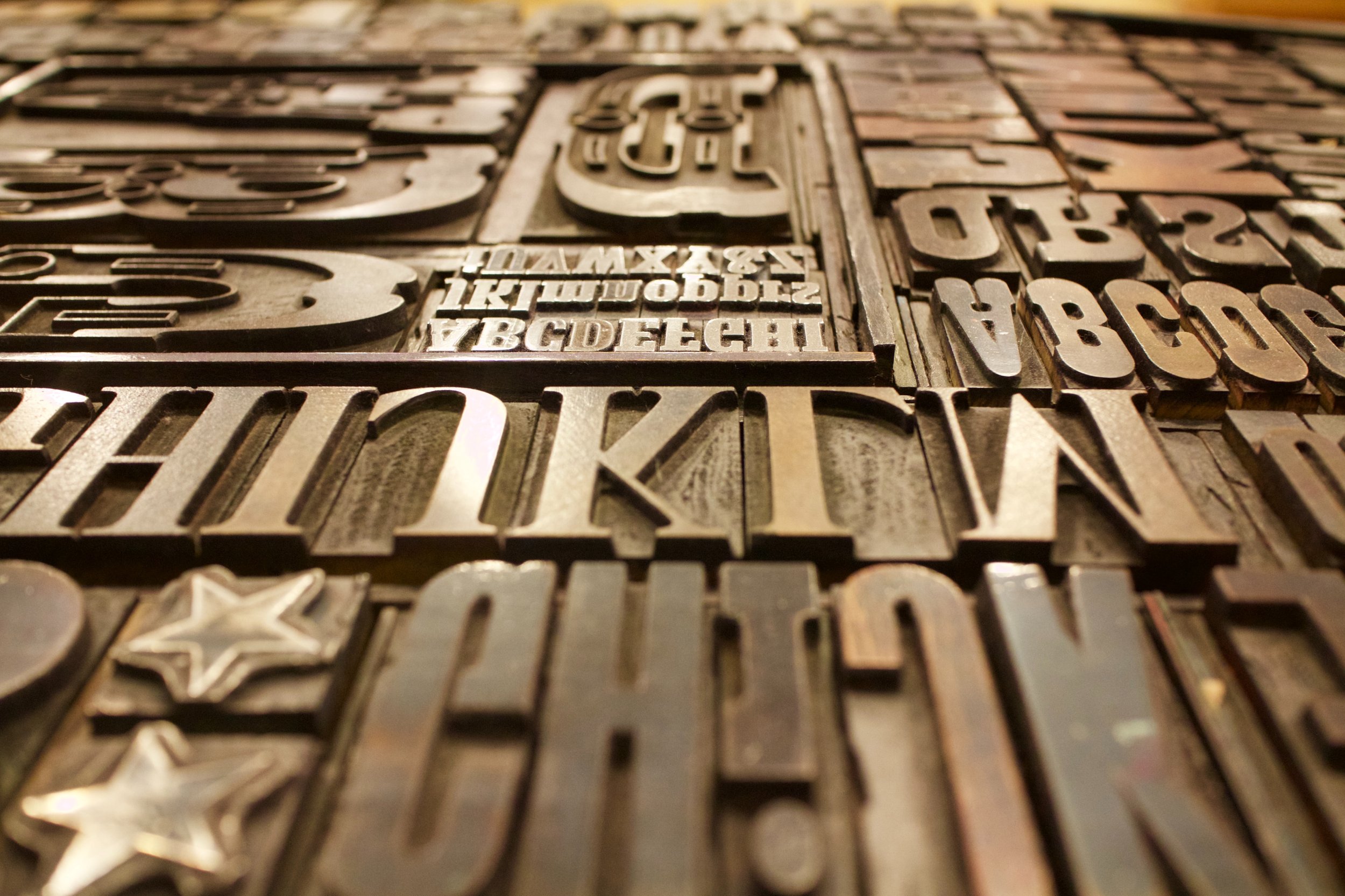
Au pied de la lettre
Reproduction d’une interview donnée à Design fax et parue dans le numéro 1277 du 1er mai 2023

Intellectual trade vs AI
If we truly possess our trade, we are not done yet :-)

Document design now
Why documents? Because we need artefacts of understanding, proof and memory.
Why design? Because documents do not naturally come that handy. They can be confusing, incomplete, ignored.

Diacritical marks on numbers? Go figure(s)!
Using diacritical marks in unconventional ways, such as to indicate the accuracy or precision of a measurement, could be seen as a creative or innovative approach to conveying information. It might also be seen as a way to add interest or personality to a piece of writing or a presentation.

2023

Vivre en 2023

The Pan-Nigerian alphabet
We all know Hermann Zapf for his countless typographic designs, from the most famous (Palatino, Optima, Zapfino) to the lesser known (such as Gilgengart, his first typeface).
But his work in creating alphabetic systems remains in the shadows.
Hermann Zapf has two such systems to his credit. From 1977 to 1984 he designed the Sequoyah alphabet for the Cherokee Indians. From 1983 to 1985, he worked on finalising the pan-Nigerian alphabet, which was intended to unite more than 400 languages.
In this article, I would like to talk about this last subject, which is close to my heart for two reasons. Firstly, because it is one of the most ambitious typographic projects to have emerged in recent years. Secondly, because it concerns a country that is particularly close to my heart: Nigeria.

Le choc Jancovici
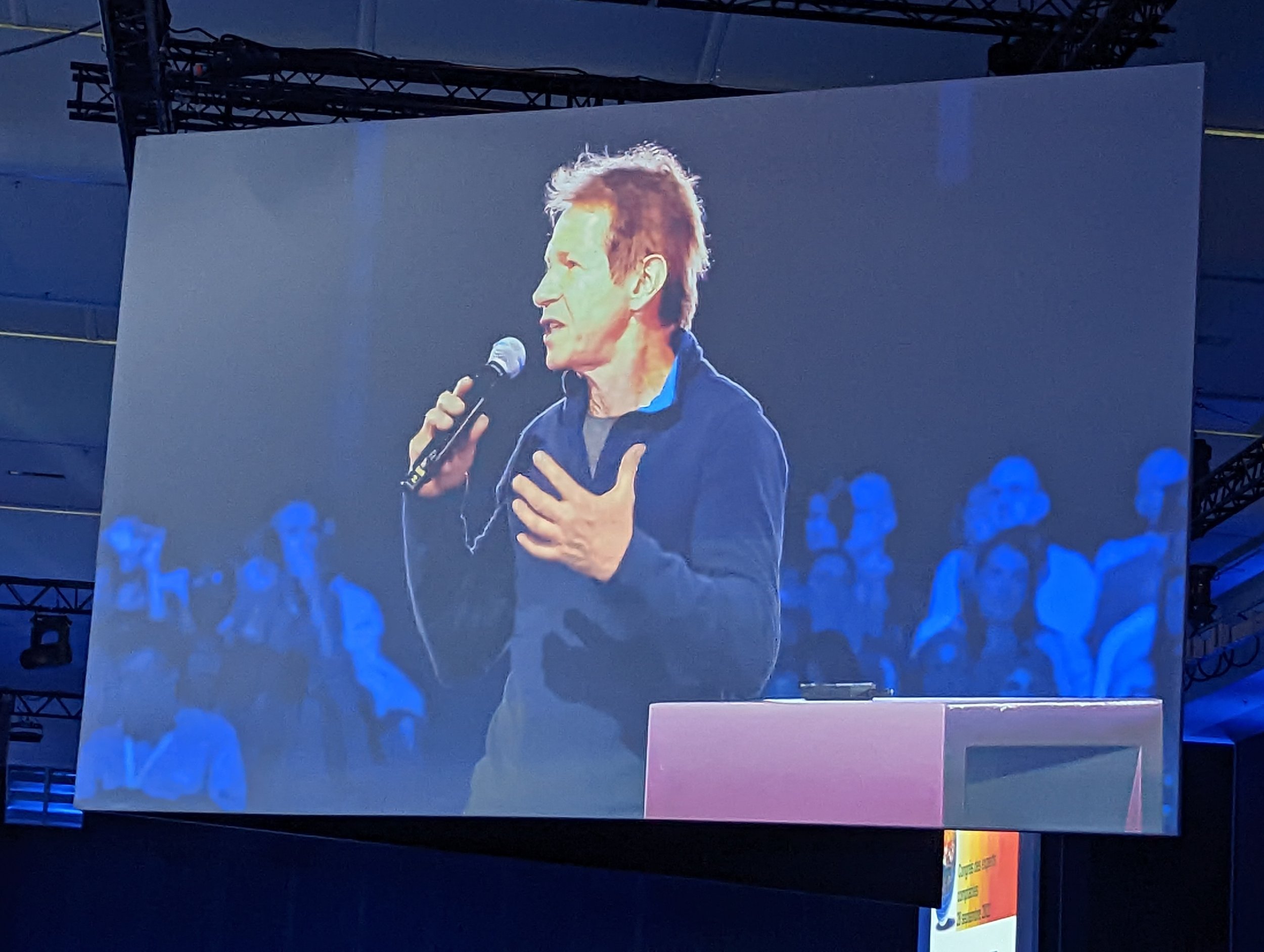
Jean-Marc Jancovici au 77e Congrès des Experts-Comptables le 28 septembre 2022 (Porte de Versailles). Mes étonnements, remarques et prolongements suite à cette brillante intervention